Minimum Viable Design (MVD) – Mobile App Edition
As mobile designers, we strive for our apps to be visually distinct with hand-crafted animated interactions that rise to the front page of Dribbble or other notable design boards. And– if we’re very lucky– get featured in the App or Play stores. Our role is to bring an app from a concept into reality, building from best practices, personal experience, and our knowledge of design principles to create an app that is intuitive, sleek, and delightful to use. We rely on developers to guide us through what is possible, performs well, and is achievable within the budget and timeline. While it is also our job to sell the client on why the app needs that custom transition, we also have to respect the budgets the client has set and do our best work within those constraints. And while we know the importance of design and the way it can influence the user, not all clients share our passion and regard for design. So how do we design for them? How do we create an interface with enough personality without all of the bells and whistles we’ve become accustomed to creating? This is where minimum viable design comes into play or MVD.
MVD
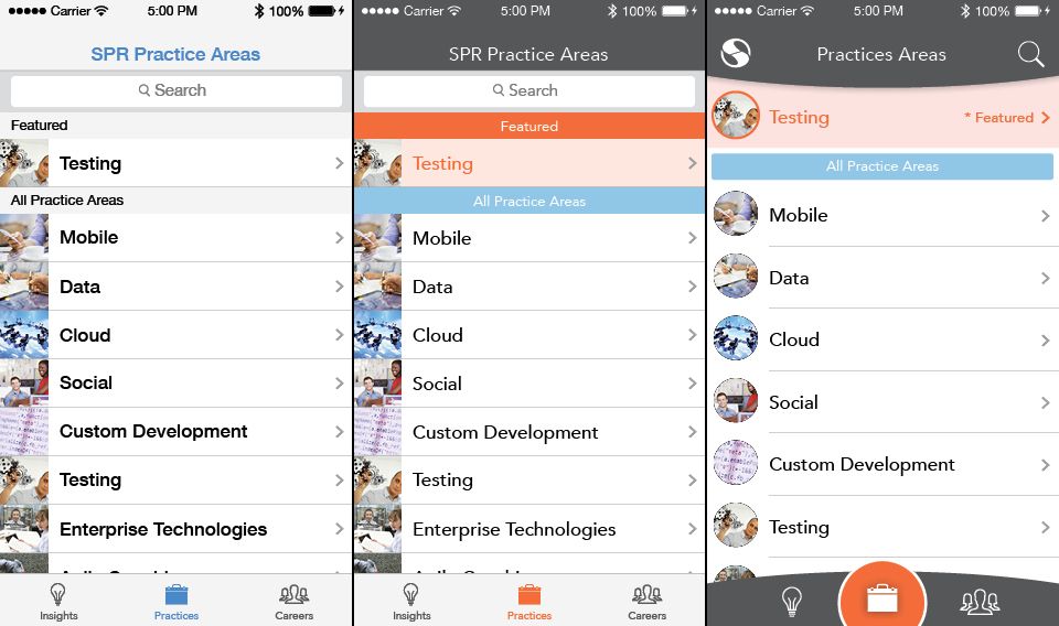
Minimum viable design is just as it sounds, the least amount of visual and architectural design to create a polished app that functions well. No bells and whistles, custom interactions, or stylized icons. As designers, it can be a discouraging endeavor, and seems to goes against our creative nature of pushing boundaries and building unique experiences. And while it may feel this way, it is actually a unique and interesting challenge. MVD strips away even the most basic UI clutter and removes any pieces of chrome typically found in a highly stylized layout. MVD embraces the core tenants of visual design; simplicity, repetition, emphasis, and rhythm.

From left to right: Stock solution, Minimum Viable Design, Full Custom UI/UX
Whether the client knows it or not, design is a core facet of each and every piece of software, both architecturally and visually. It is vital to include design in all mobile projects right from the start, typically in a Sprint 0 or other early phase. The typical design steps include Inception, Discovery, Wireframes, Comps, and then usually Developer Specifications. Each of these steps is integral in creating a focused, user-driven app where we find and define the core functions, incorporate platform specific conventions and patterns, and create guidelines for developers to implement those visual assets accurately.
Cadillac vs. Chevy
Some clients want to pay for the Cadillac treatment– which we can definitely accommodate, but most want something reliable to get them from point A to B. I like this analogy because it’s universally relatable (I drive a 2003 Camry with very well-loved bumpers) and also help drive home the point; most clients want something that just works. While the upgrades and features are nice, not everyone is willing to pay for them. We are still building an app that meets the business need– it just won’t have leather interior or heated seats.
So where is the line between stock experience and MVD? If we are stripping out all the custom work, how do we keep the app from looking too plain? Here are a few easy ways to achieve an app with a distinct look without the full UI effort:
Choose a different font.
For iOS, anything that is not Helvetica will instantly give your app a fresh personality. iOS Fonts is a helpful reference for the different system fonts, and I find Avenir, Futura, and Gill achieve a uniqueness quite well. And with the release of iOS 9, San Francisco is a welcome replacement to the old Helvetica. On Android, the updated Roboto has a lot of new weights to work with. If that isn’t fresh enough, you can load any font from Google Fonts‘ vast catalog; try Source Sans, Muli, or Ruda as alternatives.
Choose a color palette.
Both iOS and Android have system colors that are incorporated into many of the stock apps, and Android goes the extra mile with shading and accent colors. While these may not work alongside the client’s branding, these principles are very useful in creating engaging UIs. A rule of thumb, pick one primary color, generally the primary brand color, 2-3 shades of a complimentary color, and one accent color. The shades will give depth to the design, and the accent allows for utilization of hierarchy and easy to find visual call-outs.
Find suitable icons.
Icons can take a lot of time and effort to develop from scratch, so their implementation could be considered outside of MVD. However, they are a powerful tool in the representation of actions and the summary of text that can save valuable space on mobile. Material Design Icons is a very useful source with over 1,000 free, SIL Open Font licensed, hand-crafted icons which should cover any context of a MVD app. While these are stylized more towards the Android OS, they can be successfully used with some care in iOS as well. For the purists out there, Ionicons has nice sets of Android, iOS, and social icons with an MIT license.
Stick to platform conventions and stock presentation.
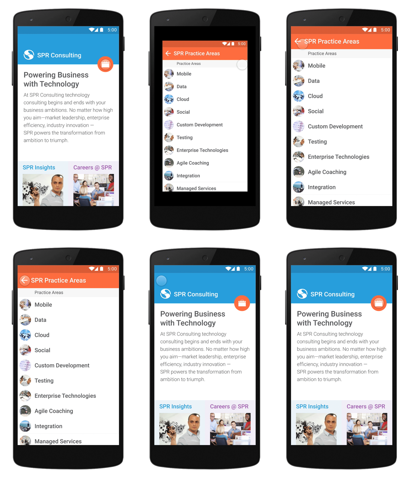
This means utilizing the OS components without much, if any, customization. Use fonts in their default sizes, capitalize on default table cell layouts, heights, and constraints, and don’t deviate from the standard system alerts and selectors. A lot of the time spent building custom apps is setting up the UI, so utilizing defaults is the best way to shave off development time.


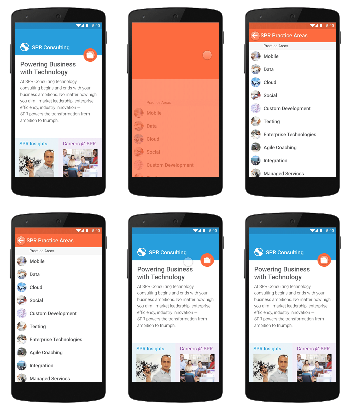
Left: Minimum Viable Design Transition. Right: Custom Transition
These are just a few of the approaches to achieve distinct UI’s for budget conscious clients. While these guidelines are fairly basic, they still follow the same principles used in full-fledged design efforts, only streamlined. The core functions and features still need to be present, which can be the one of the most challenging efforts in creating an MVD application. There can be many ways to achieve one feature, but to do so within a platform’s native convention can take a lot of thought, iteration, and creativity, which as designers is what we live for. Working within constraints in a core tenant of our Designer roles, which is why we’ve created the Minimum Viable Design concept, to help utilize the constraints of the platforms we build on and to respect the budgets our clients give us.

