Power BI Quick Tips: Visual Filters
This purpose of this article is to provide insights into how to effectively use Power BI graphical elements to filter data and enhance the overall user experience. All examples were developed with the current version of Power BI desktop using the sample AdventureWorks tabular model and a live connection.
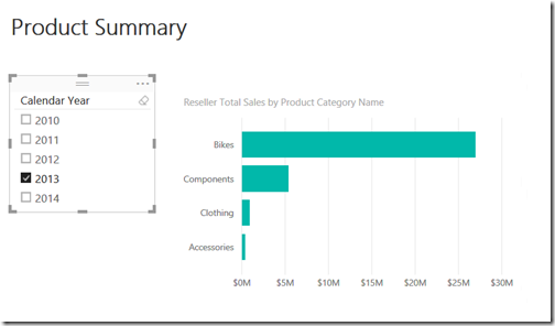
Everyone is familiar with how to use slicers to filter data in Power BI. The following example is a simple illustration.
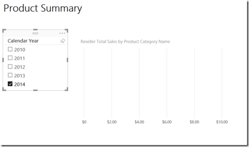
This is very straight forward and allows quick filtering of data however, sometimes this can lead to an interesting issue. In the above graph it is clear that data is being selected for the year 2013. Let’s select another year and view the results.
There clearly is no data for 2014. This may not be a major issue but it can affect the overall user experience. The information consumer has to use trial and error to determine which years have data.
This issue is a direct result of the design and use of a dimensional model. When a dimensional model is used, all elements of the dimension are included in the slicer regardless of the presence of data in the associated fact table. This means that there could be elements for which there is no corresponding data (for example: no sales for a product or customer).
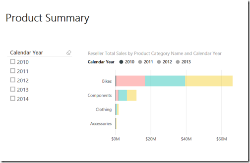
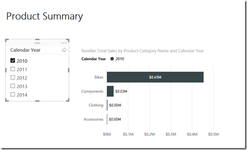
In the above example, one solution is to include the year as a component of the visualization. The addition of year will definitely solve the problem, but it can change the context and meaning of the insight that is trying to be obtained. It can be seen that data is only available for the years 2010-2013 but the slice for 2010 is very small and may be difficult to view. If 2010 is selected using the slicer, better results can be obtained. This is still a little awkward because a slicer and the graph context are being used together, but it does achieve the desired effect.
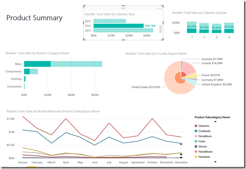
The key to developing good visualizations is to maintain the context, provide useful insights and a good user experience. Power BI provides the capability to use graphical contextual filters (visual filters) that can be leveraged to enhance the overall user experience. A visual filter works on the premise that if you select an element of a chart, that selected element applies a filter to all other elements in the visualization. Realize that this technique is not appropriate in all instances, but it is a technique that should be available in one’s arsenal. In the previous examples, the issue is knowing the total sales for a product category for a specific year. This visualization can be rebuilt as follows, with some additional objects added for demonstration purposes and using visual filters.
In the above example the 2 top charts (Reseller Total Sales by Calendar Year and Reseller Sales by Calendar Quarter) are acting as filters for all other elements on the visualizations. Using the above approach, it is very easy to visualize data at a detail or aggregate level and it can also be very effective when dealing with time and trend lines. Using this technique identifies the availability of data as well as provides additional supplementary insights. In summary, the following benefits are achieved using visual filters:
- Provides visual indication of data availability
- Allows for more complex interaction with data and deeper insights
- Can enhance the overall user experience
- Works better with charts that provide access to detailed elements (bar charts, pie charts, tree maps, maps, funnel, area, etc.)
However, this technique does have the following issues:
- Increases overall complexity of visualization
- Can become confusing if the purpose of each object in visualization is not fully understood
- May result in visual clutter if the desired insights are not clear
- When used with line charts, only items defined in the legend can be used for filtering
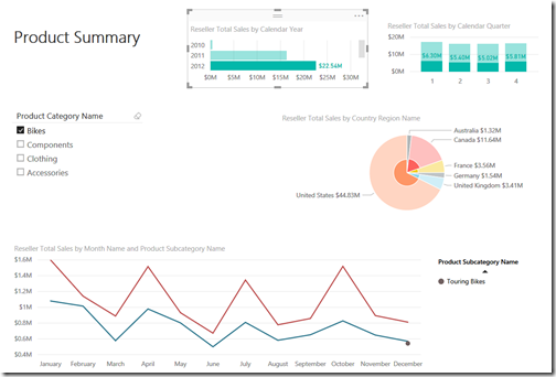
Another thing to consider is that that the above technique can and should be used with standard slicers and Power BI page level filters where appropriate. The following example uses a slicer on Product Category Name with visual filters.
The goal of this article was to present additional options on how to increase the versatility of Power BI visualizations and depict a different way to use Power BI graphical elements. Hopefully, this approach will spark new ideas and approaches to using Power BI. Remember, there is always more than one way to achieve a goal. It’s the path taken that makes the journey enjoyable.
Please feel free to contact me with questions or comments. I am very interested in other approaches for enhancing the flexibility of Power BI visualizations.

