A Guide to Using R with Power BI

The integration of Power BI and R has greatly extended Power BI’s capabilities. However, it can be challenging to know the best times to use R. Using R and Power BI within the context of the Power BI service and Power BI desktop does have its limitations, mainly that R output must result in an R graphic object. Therefore, this blog post provides a brief list of guidelines and examples to help determine when to leverage R functionality inside of Power BI.
Data Visualization
The need to produce custom visualizations that are not readily available via Power BI.
The number of built-in and custom visualizations available within Power BI – including the recent custom R visualizations – continues to increase. However, sometimes you simply need the additional customizations provided by R.
One example is the use of facets available with the ggplot2 package. Facets allow you to add extra dimensions to a base plot to create subplots. Let’s explore this using the mpg dataset that comes with R.
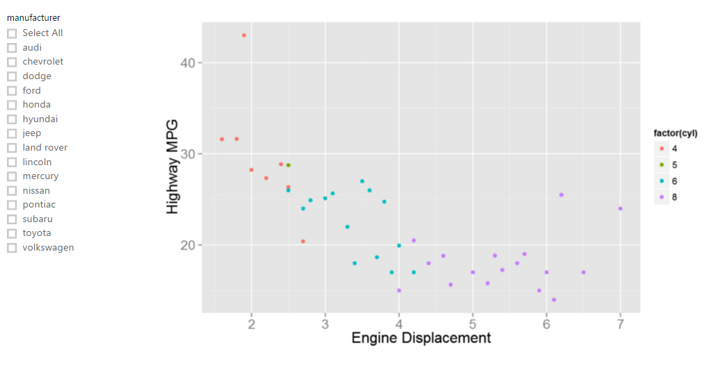
The base plot is created with the ggplot2 package and displays engine displacement versus highway MPG. It will also feature some minimal formatting. You can learn more about implementing R visuals within Power BI by visiting the Microsoft Power BI webpage.
For this example here is the sample code and the resulting plot:
# The base plot
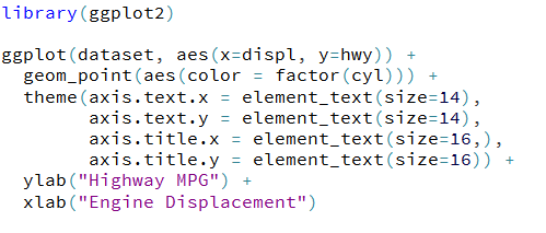
The base plot is a simple scatter plot, but allows for customization and interaction with Power BI filters. This plot could be produced using native Power BI functionality. However, for consistency, everything is being rendered using R visuals.
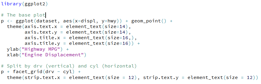
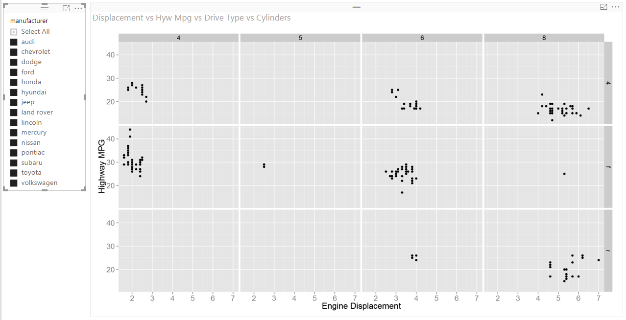
Now we would like to group the plot by number of cylinders and drive type ((4)-wheel, (f)ront-wheel, (r)ear-wheel). Here is the updated code to accomplish this as well as the resulting Power BI canvas. The modification to the existing code includes a “facet_grid(drv ~ cyl)” statement to produce subplots within the original plot of “Highway MPG vs Engine Displacement”. The color aesthetic was removed because facets are being applied.
The resulting plot diplayed on the Power BI canvas contains subplots and as with the previous plot, it is dynamic. That means it responds to Power BI filters and selections.
Data Integration and Manipulation
There are many more complex visualizations available in R. If you are looking for a visualization that is not readily available, consider some of the R graphics packages. The learning curve is not too steep and it is well worth the effort to get that little something extra into your visualizations.
The need to transform data using a fine grain control
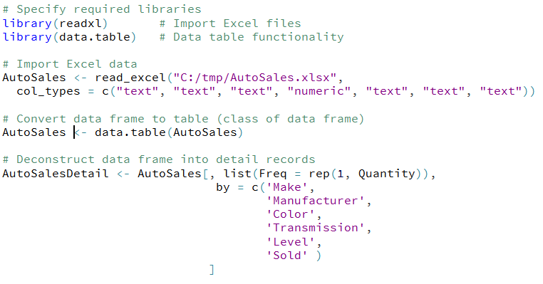
R has an extensive capability to manipulate and transform data. There may be instances where it is necessary to transform data after it has been imported into Power BI in a way that is somewhat challenging to implement in Power BI. One example is data is at an aggregate level but for the purposes of data analysis it needs to be deconstructed. Granted, this is a very specific use case but it goes to demonstrate the capabilities of R and Power BI. Here is an example where data Is only available at the aggregate level but does not provide enough information for prediction. The data will be de-constructed to provide the necessary observations.
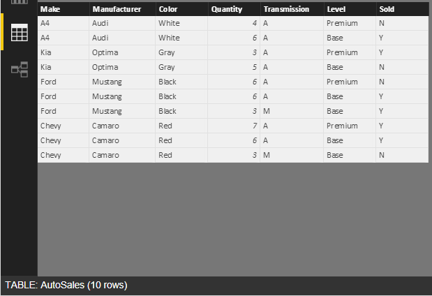
Below is sample auto sales data provided in aggregate in an Excel spreadsheet. The goal is to deconstruct the data to get to a pseudo-transaction level. Rows correspond to the summarized quantity. This type of transformation can be easily performed using R.
| Make | Manufacturer | Color | Transmission | Level | Sold | Quantity |
| A4 | Audi | White | A | Premium | N | 4 |
| A4 | Audi | White | A | Base | Y | 6 |
| Kia | Optima | Gray | A | Premium | Y | 3 |
| Kia | Optima | Gray | A | Base | N | 5 |
| Ford | Mustang | Black | A | Premium | N | 6 |
| Ford | Mustang | Black | A | Base | Y | 6 |
| Ford | Mustang | Black | M | Base | Y | 3 |
| Chevy | Camaro | Red | A | Premium | Y | 7 |
| Chevy | Camaro | Red | A | Base | Y | 6 |
| Chevy | Camaro | Red | M | Base | N | 3 |
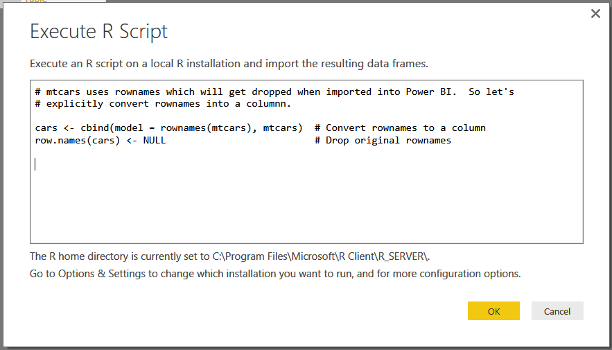
The following R script imports the Excel data and deconstructs it.
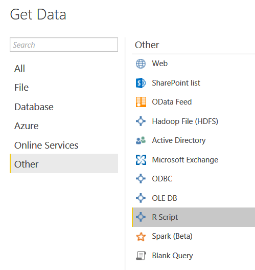
The script is inserted into Power BI via the get data function and selecting “R Script” as shown below:
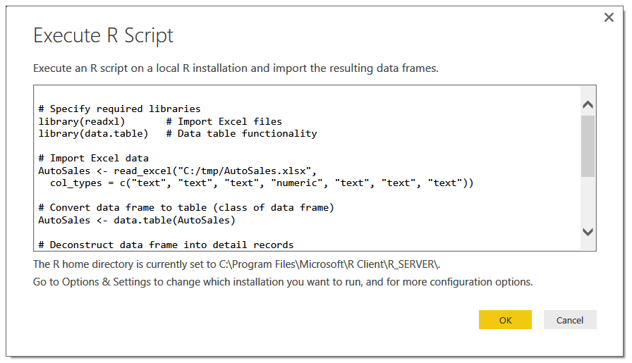
Script pasted into Power BI R script editor:
After the script is executed, two tables have been created. The original source table and the de-constructed table.
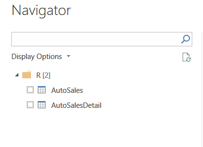
Here are the results of the executed script with the imported Excel table and the deconstructed table.
Imported Excel table
Deconstructed table
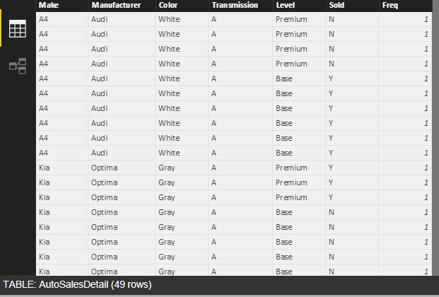
The deconstructed table now contains 49 rows based on the quantity specified in the original table. This technique can also be used to create data if there are insufficient rows to represent all the potential classes that can be represented in the data. Another reason to use this approach is that Power BI scripts want to remove duplicate data. Using this approach, detail can be constructed as necessary to meet analytic requirements.
Flexibility and Control
The need to use other analytic and data mining approaches and techniques
Power BI has incorporated commonly used R analytic functionality. Curve smoothing and regression analysis are directly exposed via Power BI R visualizations. There are other techniques that may provide a different perspective when analyzing data. It is these cases where using R directly may be more appropriate.
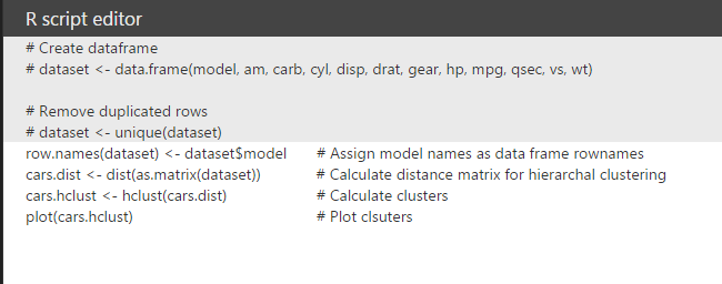
One of these analytic techniques is hierarchal clustering, which does not require the explicit definition of the number that will be created. It produces a tree (dendrogram) to visualize how clusters have been created.
Going back to automobile data, the goal is to determine what clusters exists based on automobile attributes. The data to be used is a sample dataset provided by your installed R distribution. The following R script will be used to import the data into Power BI:
The following R script will produce the hierarchical clustering model and visualize it:
Finally, here is the visualized hierarchical clustering model:
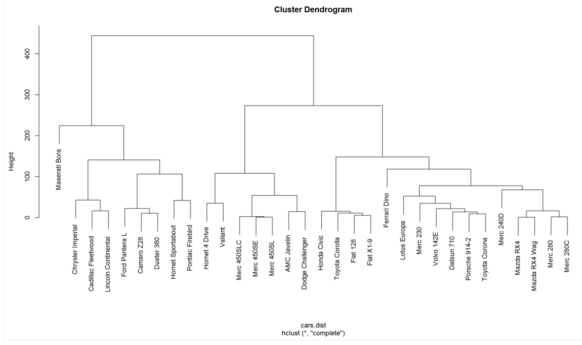
The point of the previous exercise is to illustrate the power of integrating Power BI with R. Suppose there was a geographic component to the data; it would then be possible to visualize clusters using geography as a filter or incorporate it directly into the analysis, depending upon the requirements. There are many other statistical and machine learning capabilities that can be exposed using the previously defined pattern.
Branching the Divide
Rationalize and leverage existing R models and analyses
R is an extremely powerful tool. However, this power does come with some complexity. There are multiple IDEs, thousands of packages and a myriad of approaches and methods for accomplishing the same task.
An experienced R practitioner could leverage the R Shiny (interactive graphics) package to accomplish some of the same things we’ve presented, but there some level of additional custom development is still needed to deploy the results to a wider audience. Using R with Power BI provides a more functional environment, allowing individuals to present their findings in a way that can be easily consumed, and at the same time educate their consumers.
Only a few guidelines have been presented but they should be sufficient to begin discussions for other use cases. It would be interesting to know what others in the community are doing with respect to R and Power BI.
References
Chang, Winston. “Chapter 11/Facets.” R Graphics Cookbook. Beijing: O’Reilly, 2013. N. pag. Print.
Kodali, Teja. “Hierarchical Clustering in R.” R-bloggers. DataScience+, 22 Jan. 2016. Web. 12 Dec. 2016.
Iseminger, David. “Running R Scripts in Power BI Desktop | Microsoft Power BI.” Microsoft Power BI. Microsoft, 29 Sept. 2016. Web.